UI/UX Design
VisaPath Korea is a concept mobile app designed to simplify the Korean visa process for foreigners, whether it be first-time visa applications, managing extensions or understanding policy updates. The app centralizes document checklists, sourcing guidance, deadline tracking, and real-time policy changes into one clear, English-friendly experience.
Client
VisaPath Korea
Year
2025
Services
UI/UX Design
Tools
Figma, FigJam
Challenge
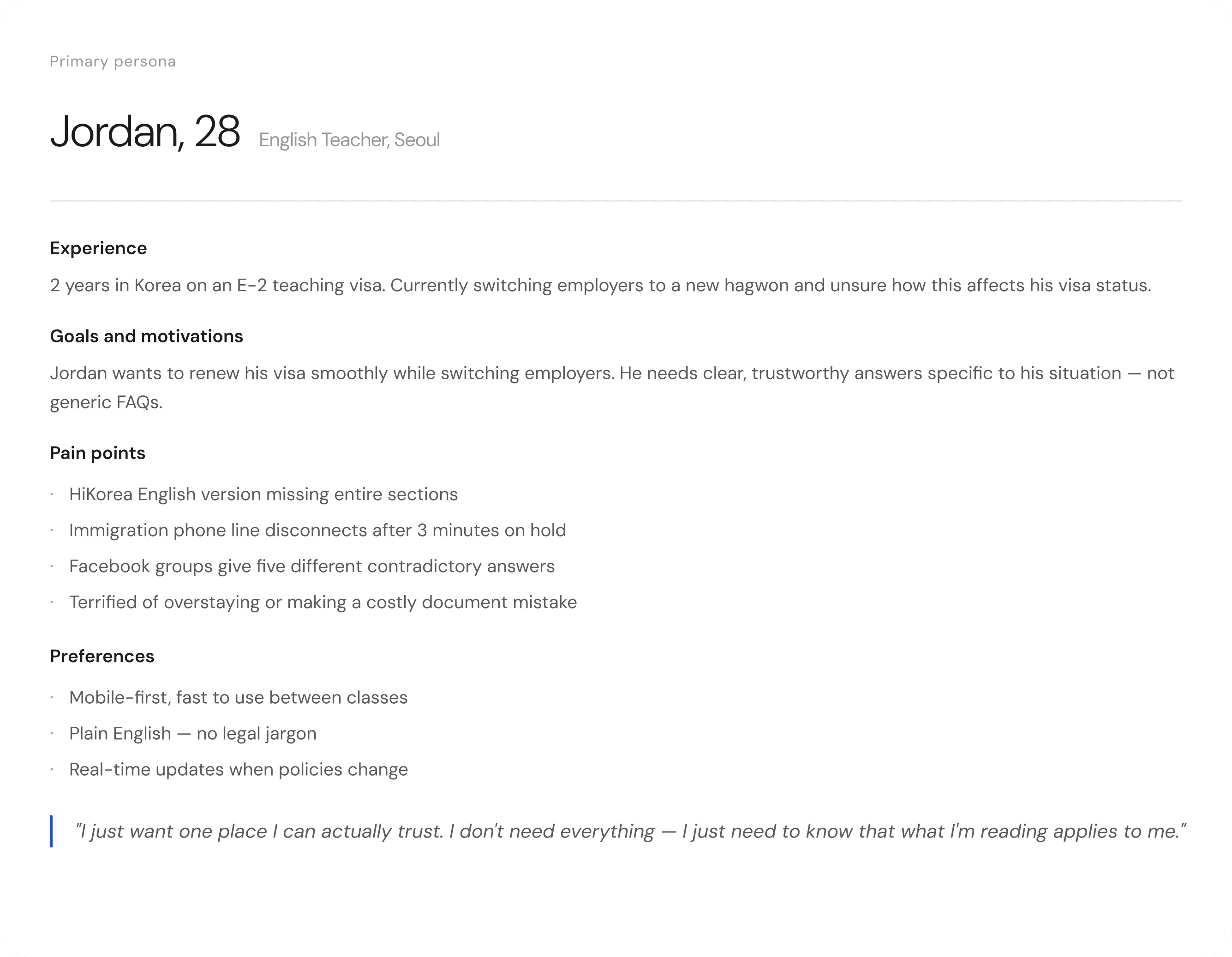
Navigating the Korean visa process as a foreigner is a fragmented, frustrating experience. The primary government resource, HiKorea, offers an English version that lacks the depth of its Korean counterpart, and reaching the immigration office by phone often results in long holds that disconnect automatically, leaving applicants with no reliable way to get answers to situation-specific questions.
The task was to design a trustworthy, accessible, and anxiety-reducing mobile experience that gives foreigners in Korea a reliable way to navigate their visa journey without needing to speak Korean or decode opaque government systems.
Solution
By understanding the specific frustrations and anxieties of foreigners navigating the Korean visa system, VisaPath Korea can address their exact challenges with a trustworthy, efficient, and personally relevant experience.
Principles
Clarity over completeness: Jordan doesn't need every possible piece of information. He needs the right information for his exact situation, clearly presented.
Trust through transparency: Every piece of content shows its source and last-updated date. Users can verify independently.
Speed for mobile moments: Jordan checks this between classes, on the subway, during lunch. Every interaction should resolve in under 60 seconds.
Progress as relief: Completing documents should feel rewarding, not administrative. Every checked item should reduce Jordan's anxiety, visually and emotionally.
Results
This project reinforced how much the emotional context of a user shapes every design decision. Jordan isn't just confused, he's anxious about his legal status in a foreign country. That changes everything: the tone of copy, the visual weight of the expiry date, the color of a checkmark. Designing for anxiety is fundamentally different from designing for convenience.
I also learned how much research grounds UI decisions. Before I understood why HiKorea fails its users, I was designing generic features. After, every screen had a reason to exist.


